Client
Jodie Bees | We are Well Women
Industry
Health & Wellness
Our role
Brand discovery
Brand identity design
Brand tool kit creation
Overview
As a successful naturopath and nutrition consultant who had reached full capacity with her one-to-one services, Jodie could no longer take on more clients. However, with a passionate calling to serve and reach more women and help them with their health and wellness, she wanted to build her community called 'We are Well Women.' This community aims to bring women together to support, educate, and inspire towards true health and whole wellness.
Jodie's vision was to grow the community by hosting live speaker events and expanding her existing podcast. She had already recorded multiple podcast interviews with experts in the wellness sector. However, she was unclear about how to incorporate the podcast into her online presence given her 'Jodie Bees' brand and the 'We are Well Women' sub-brand. As the show host, she aimed to utilise her expertise and knowledge to develop new service and product offerings in the future.
Our approach
Through our discovery workshop together, we dove deep into the core of her ‘We are Well Women’ brand based on 6 key foundation values; authenticity, integrity, wellness, nature, health, growth and sustainability.
Jodie’s intention was to create a community, inspired by ancient ways of women sharing wisdom, a village and ‘well’ that would serve as a source of nourishment and belonging. A place, where women can share and receive wisdom from their sisters and embrace their authenticity and wholeness.
The name ‘We are Well Women’ was derived from the concept of a well that offered water, a source of life and was a place where generations of women would gather to share their wisdom and offer support.
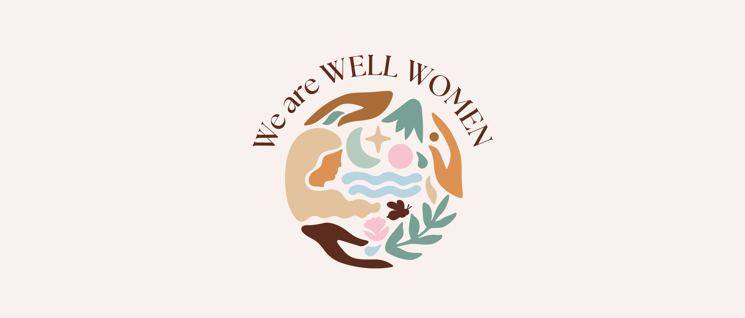
We aimed to create a symbol that elegantly expressed women uniting, supporting each other, honouring Mother Nature, and being thankful for the bounty of nourishment and healing that She provides. Moreover, we wanted to convey an appreciation of the moon cycle and compassion for people and the planet.
The results
The new ‘We are Well Women’ brand features a unique hand-drawn symbol that beautifully represents women coming together to support each other while showing gratitude to Mother Nature for the nourishment and healing it provides. The symbol also embodies an appreciation for the moon cycle and a compassionate attitude towards people and the planet. We also included an illustration of a small bee as a heartwarming reference to Jodie’s namesake.
In addition to this, the brand includes secondary graphics that can be used as social media backgrounds. These graphics convey warmth and care, reflecting the wholeness of women and the abundance of Mother Nature through gentle and fresh tones.
We also updated Jodie's brand colour palette and used the same colours in the extended ‘We are Well Women’ brand. This offered versatility when posting on social media and offered an inviting set of podcast templates for Jodie’s varied guests and her audience.
Whilst rebranding 'We are Well Women', we went the extra mile and gave a refreshing makeover to her 'Jodie Bees' logo as well. We created a simple 'JB' monogram that would give versatility in her online and offline presence. Knowing Jodie's love of green and everything natural and earthy, we crafted a hand-drawn and unique mark that truly reflects her empathetic and caring nature.


